10 elements that all product pages should have
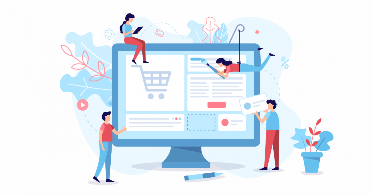
Theoretically, product pages are very simple: they allow the customers to make an informed purchase and proceed with their order. However, there are some elements that should be taken into account to boost sales and make the customer experience more enjoyable – it's important that these pages are intuitive and easy to consult.
The goal is clear: to make the customer buy the product. What, then, are the elements you should include in your online store, in order to increase the chance of purchase by the visitor?
Photos and videos of the product
Product photography is decisive for the order, so you should choose the style that best suits the product featured on this page. Regardless of presenting the product in a real environment, on a white background or in a model, it's important that the photographs depict: 1) the product as a whole, and 2) some relevant details. If the size of the product is not obvious and if this is an important factor for the customer, comparative photography should also be included.
On the other hand, it may make sense to present a video of the product to better demonstrate its characteristics and the concept associated with it. You can tell excellent stories through a short video, showing the customer all the potential of the product he's viewing, and encouraging the purchase.
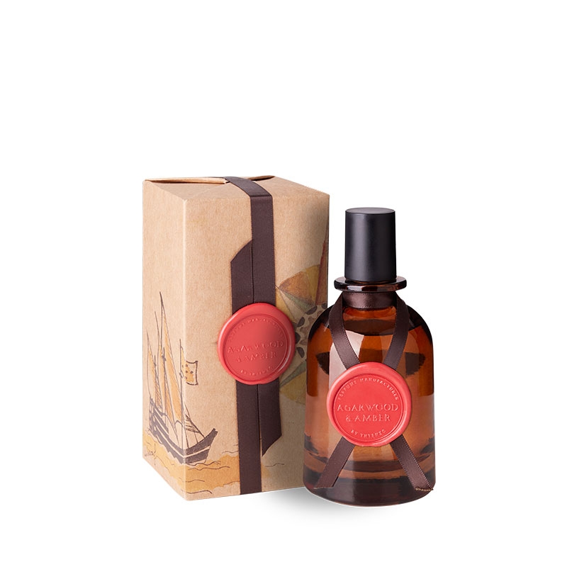
Image: Yntenzo
CTA (call-to-action)
If the goal is to get the customer to buy the product, then the CTA should be clear. This is the button that leads to the realization of the action, and in this case it should be as obvious as possible – ‘Shop’, ‘Add to Basket’ or ‘Add to Cart’ are good examples that leave no room for doubt and do not hinder the purchase process. In this element, originality is left out – we want the customer to immediately realize where he should click to place the order, because if it's not intuitive the customer is most likely to leave the page without purchasing.
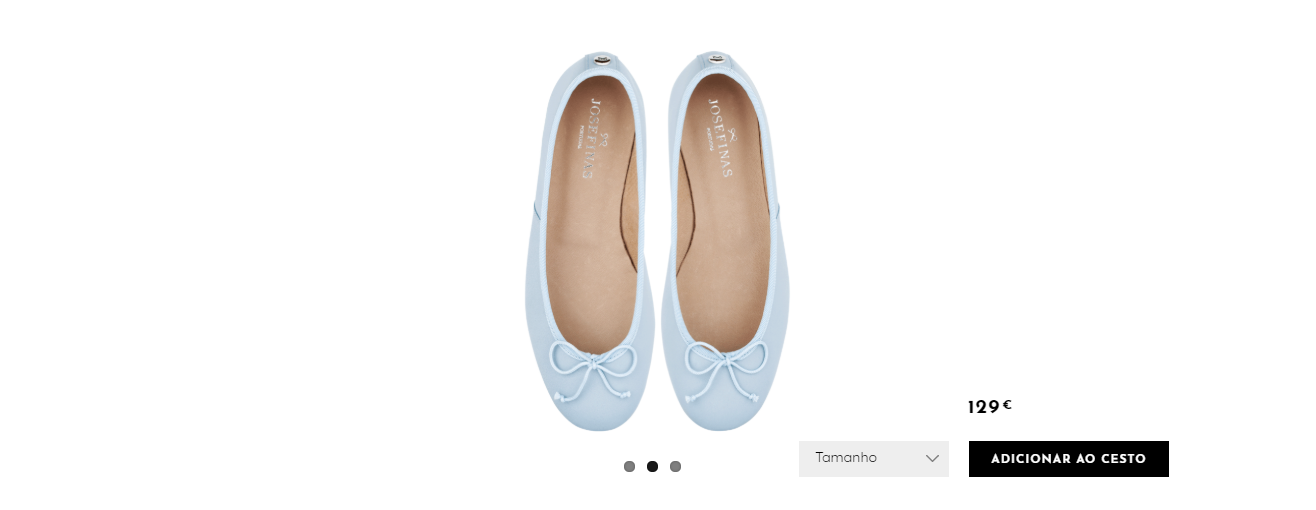
Image: Josefinas
Price
One of the key factors for the purchase is undoubtedly the price. This means that without this information (even if it's shown in a next step and without compromise), a great part of people will not add the product to the cart. This information should be easy to identify, especially if a promotional campaign is underway (in this case, the two prices – the current one and the previous one – should be shown, and the highest price should be crossed out so as not to cause doubts).
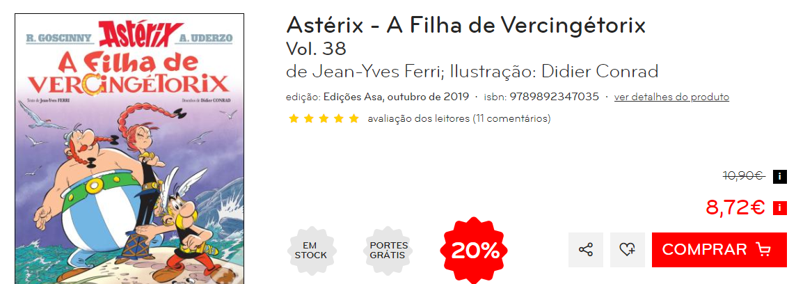
Image: Wook
Ongoing promotional campaigns
In the event of a promotional campaign, this information should be very explicit on the product page. This statement can be fixed or pop up while the customer visits the page, but it should be easy to identify. If the price reduction is associated with a special campaign (Black Friday or Christmas, for example) it's convenient that this condition is clear, so that the customer feels a sense of emergency to make the purchase (before the day, week, or campaign end).
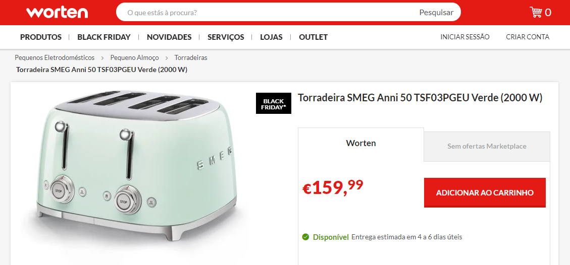
Image: Worten
Description and features of the product
We should never assume that the customer knows the product as well as the brand – even if most orders are made by loyal customers! - so all relevant characteristics must be presented in a text, as well as be visible in the photographs – technical information and specific recommendations for use, if necessary, should be easily understood.
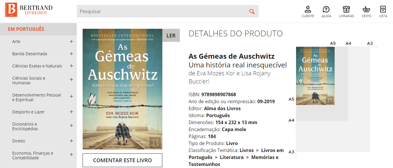
Image: Bertrand
Product variations
If the product has different variations (color, size, model...) it's important that the product page features a way to select the desired variation, avoiding dozens of the same products in the store and, of course, some possible confusion that could arise from the customer's side. Thus, not only is the purchase process made simpler, but the process of managing the online store when adding new collections, modifying prices or removing discontinued products will also be simplified.
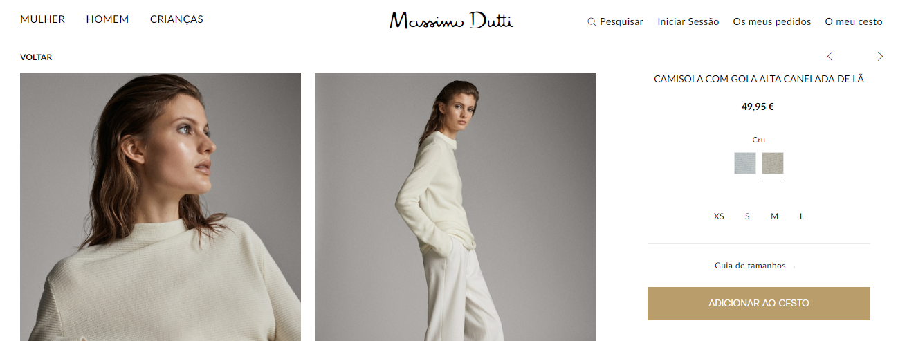
Image: Massimo Dutti
Product availability and restore alert
Is the product available for immediate delivery? Is it only available online? Is it available to pre-order? If the product is sold out, this information should be obvious, so that the customer doesn't feel defrauded (whether the e-commerce allows to place this order is another topic that should be evaluated case-by-case). However, in the event that it is actually sold out, there should be a possibility for the customer to receive an alert (via email or in their customer account, for example) at the time it is restored - this is also a way to guarantee the sale.
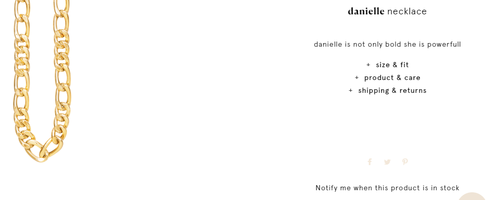
Image: Cinco
Reviews
The odds to purchase increase when the customer reads a positive opinion about the product he's considering. So, if possible, the product page should include testimonials from previous customers and/or a scoring system that invites product and brand's connoisseurs to share their experience.
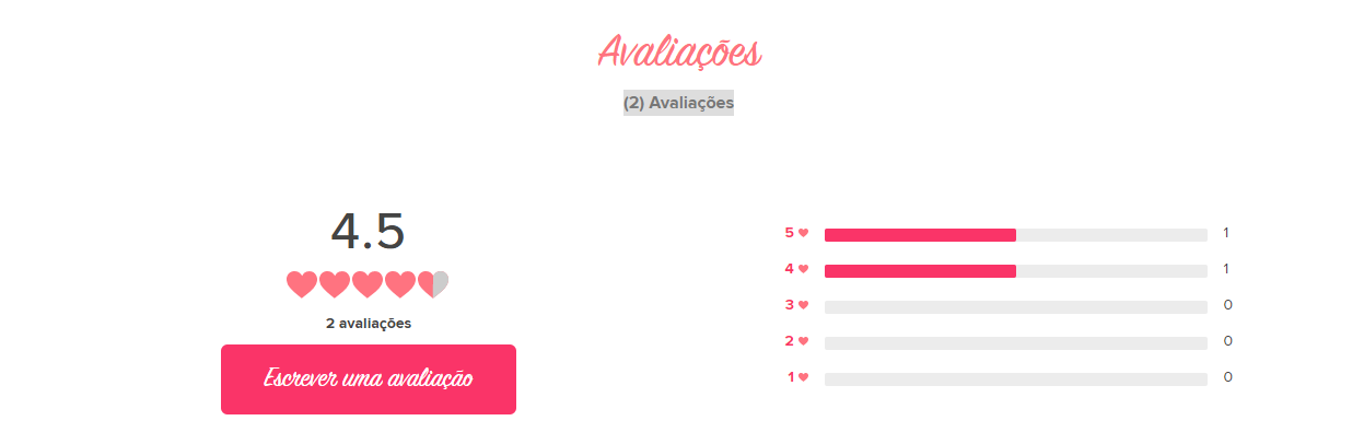
Image: Benefit
Suggested products
One way to encourage the increase on the amount of products in each order and, consequently, increase the average ticket is to suggest a few more items on the page of a given product. In the case of a piece of clothing, as in the example below, it will be interesting to suggest other pieces that are available and that work well when combined with the product that the customer is viewing. However, they can also be complementary products (such as the suggestion of accessories for the computer on the page of a particular model, or the suggestion of a fabric softener while the customer evaluates the purchase of the detergent).
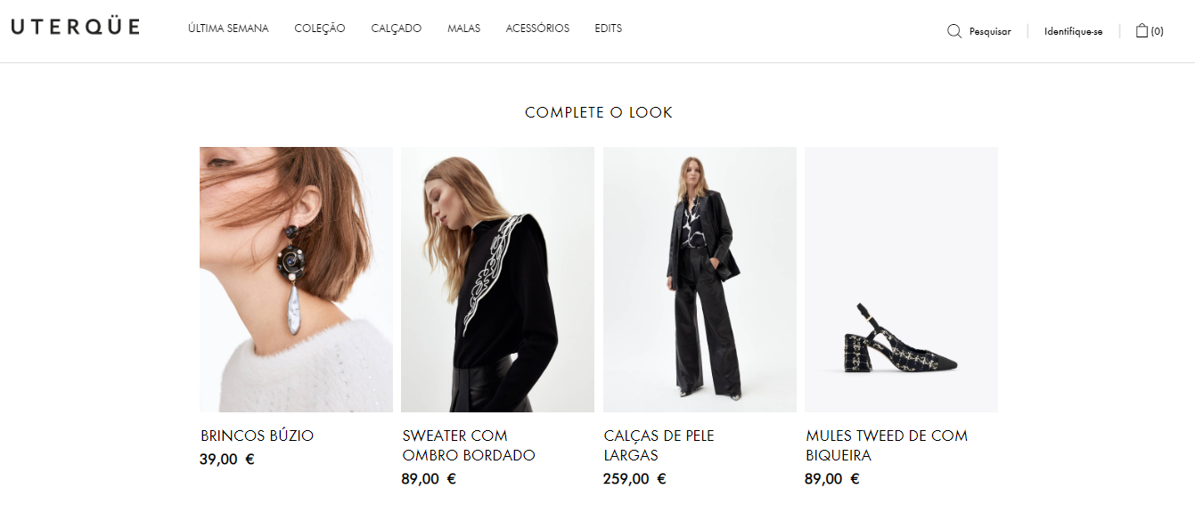
Image: Uterque
Share buttons
Social networks are an important channel for most businesses, so the inclusion of share buttons is a way to help in the dissemination of the product and encourage the customer to recommend it and share its opinion, in case it isn't its first order. It's recommended that the product page has buttons for sharing on different social networks, as well as for sharing via email.
Image: Mahrla